Saturday, April 9, 2011

Simple but amazing

I came across this link in a message board thread at The Escapist. It's a black and white grid. You click on the squares in the grid and each square corresponds to a music note. You can make a pretty cool tune even if you're not musically inclined.

http://seawitchery.tumblr.com/post/4070384205/i-started-out-clicking-strategically-and-by-the

Check it out!

Thursday, April 7, 2011

Why does the Google Talk web interface suck?

I am a big Instant Messenger (IM) user. I've been using one service or another since the mid-to-late 1990s. First it was ICQ, and then AIM. Yahoo and Microsoft came along with their IM services. Each of these had their own client applications that you used that allowed you to sign on, see which of your buddies were online, and chat with them at your leisure.

Like most things, IM clients matured as time went by. They added features like telling you when your buddy was typing or had entered text without sending it. Voice chat was introduced. Rudimentary file sharing was invented. But also basic things, like contact sorting, message coloring, buddy icons, groups, and all other manners of customization came along.

Then, as it became unwieldy to run 6 different applications just to be able to talk to your friends on all the different IM networks, some enterprising developers came up with multi-service IM clients. These clients, such as Pidgin or Digsby on Windows, or Adium on Mac OSX, allow users to connect to many different networks from one application, using a unified contact list. This makes for a much cleaner desktop and a more streamlined experience. And all of these programs have countless customization options to make your IM experience as personal, efficient, and useful as possible, while at the same time being lightweight and unintrusive.

Enter Google Talk (AKA Google Chat, not to be confused with Google Voice). With the rise of gmail as the E-mail service of choice for the cool kids, Google strategically created an IM service to go along with it. Google Talk allows those in your address book who also have Gmail accounts to have IM conversations with you. Google Talk was and is still primarily a browser-based IM service, although it is based on a protocol that is very widely supported by third party clients (such as Adium, which is how I connect to it).

But most people (you included, probably) just use the browser-based interface to Google Talk that is integrated with Gmail. And oh boy, the thing is vile. So vile that I can't freaking believe that anyone can stand to use it.

First, the contact list and message box are ugly as sin with no way to customize them. Oh, sure, you can choose "small", "medium", and "large" for the contact list size. By the way, I actually mistook that to mean the font size. My mistake. What it really does is change how many of your contacts are actually shown. What if you want Medium-Small? or Medium-Large? You're SOL. Okay, so maybe that's not such a big deal. Setting it to small should be fine because I don't have that many friends. Okay.

The only other option they have for your contact list is "Show in chat list" whose two options are "Most Popular" and "All Contacts". There is no option to Hide Offline Contacts. C'mon, Google! this is IM Client Design 101! I don't care who's offline, only who's online! The lack of a Hide Offline Contacts option makes the "Show All Contacts" option a load of crap. So then we have our other choice, "Most Popular". You would think this would be based on who you talk to the most, either over email or in Google Talk itself. But when I chose this option, someone I hadn't talked to at all for over two years was placed near the top! Shit, Google.

And that's it. No other options.

But I'm not done yet.

One last thing. IM can be considered the least formal means of communications in the digital world. This means that grammar goes out the window. Sentence fragments are allowed. You may type a whole sentence and send it out without a period, and that would be okay.

The following is also acceptable: I and many others have the tendency to start a sentence, and press Enter to send the message before the sentence is complete, and then finish the sentence in the next line. I don't really know why we do it, but I guess it keeps the pace up and maintains the flow of the conversation, so the recipient doesn't have to wait for the whole sentence to be typed out and end up receiving a "wall of text" when it's done. It also can help to subtly indicate where natural pauses or breaks are, without resorting to putting commas everywhere, resulting in runs-on sentences, which nobody likes. Whatever the reason, I do it a lot. Like the full sentences described in the paragraph above, these "partial sentences" also do not end with periods.

What does this have to do with Google Talk's web interface? Well, the way the conversation box is implemented, consecutive instant messages from the same sender are grouped together, such that instead of being like:

omnigeno (6:30 pm): hey, have you ever been
to Original Tommy's
burgers at Universal
Citywalk?
omnigeno (6:30 pm): I'm working 'til 8 tonight
omnigeno (6:31 pm): but if I leave to get food,
I ain't comin' back

It instead is displayed as:

omnigeno (6:30 pm): hey,
have you ever been to
Original Tommy's burgers
at Universal Citywalk?
I'm working 'til 8 tonight
but if I leave to get food,
I ain't comin' back

The first example sort of makes it easier to see where the natural breaks are, whereas the second one just looks like a pair of overgrown, deformed haikus.

In the first example, it's clear that the whole first sentence about Tommy's at Universal Citywalk was in one continuous message, but the word wrap was due to the small size of the IM box. In the second example, however, there's no way to tell. It's a big mess.

It's clear that this was designed purely to be utilitarian, to be sure, but I really feel as if they put all their effort into the backend, and hired the 10-week intern to design the user interface.. and she spent 3 days on it.

The Google Talk Gmail web interface is an awful piece of junk, and the only reason why I resorted to using it this week is because my work no longer allows me to install unapproved applications on my computer.

Google, why does your chat interface suck so badly?

Sunday, January 16, 2011

Crazy iPhone 5 Prediction

If you haven't been living under a rock, you probably know that this past week Verizon announced that iPhone 4 (or iPhone in general) is finally going to be available on Verizon's network. Once the excitement wore off, I got to thinking. Actually, I started thinking this several weeks before the announcement, since the rumor mill had been reaching a fever pitch, and I was skeptical.

So as you probably know, up until now there has always been a new iPhone released every summer. That is, in the US, there has always been a new iPhone on AT&T's GSM data network every summer. And since the GSM iPhone 4 came out on AT&T's network last summer, it would logically follow that the iPhone 5 (or whatever Apple decides to call it) will be released for AT&T customers this summer.

But where does that leave Verizon? iPhone 4 is going to be released on Verizon's CDMA network on Feburary 10, a full 7 months after iPhone 4 debuted on AT&T's service. If Apple keeps their release schedule on Verizon similar to AT&T's, that means that iPhone 5 will come to AT&T this summer, while Verizon will have to wait until February 2012 to get the iPhone 5. This makes absolutely no sense.

So here's my wild theory, based on absolutely no real evidence.

CDMA iPhone 4 comes out on February 10 on Verizon as planned. Then, in the Spring, the white iPhone 4 will not come out, despite what Apple said last October. In June, Apple will announce a simple iPhone refresh, probably still called iPhone 4 or something. In this refreshed iPhone 4, Apple will nix the 16GB version and lower the price of the 32GB version by $100. They will also introduce a 64GB model, a first for iPhones. The A4 processors in these iPhones will also receive a minor speed boost. And finally, these new iPhones will be sporting a new hybrid CDMA/GSM cellular chip, which will make it so that the phones work on any carriers' networks, but unfortunately will only see wide usage for a year. This is because in summer 2012, an LTE-based iPhone 5 will be released on both Verizon and AT&T.

Saturday, November 13, 2010

Game Review - Soosiz

Soosiz - $1.99 (Appshopper Link)

Mario-style platforming games are kind of a hit or miss with the iPhone's on-screen controls. Depending on how the developer implements the buttons, it could be very bad (like Mega Man II), or very good, like the game I'm reviewing right here. For action-platforming games, reflexes are key; being able to jump at a moment's notice to avoid an enemy or obstacle is the difference between life and death. The problem with on-screen controls is that there's no physical feedback for your finger to know whether you've pressed the "right button" (read: the correct part of the screen). In the iPhone port of Mega Man II, I too often found myself pressing not the jump button, but just one or two pixels to the left or right. Yes, that's a problem.

With Soosiz, on the other hand, the developers did a great job. The jump button is big and responsive, as are the buttons to run left and right.

So you're probably wondering "So what is Soosiz? Why is its name so funny?" Well, I can't answer the second question, but I can answer the first. Soosiz is unique in that it takes the 3-D Super Mario Galaxy style gravity mechanic and removes one dimension, to give you a rather fresh side-scrolling (and rotating) experience. In this game, "down" for your character is essentially the center of mass of the platform he's currently standing on.

You play as this strange yellow circle with big feet, big eyes, and green spiky hair. If I didn't know any better, I would think he's a mutated Goomba.

The levels are set up as a collection of worlds broken down into about 6 stages each, along with two or three bonus "collect all the blue coins" stages. The goal in each normal stage is to rescue all your buddies who have been scattered across the land. Some of them grant you special powers like higher jumping and faster running, which last until that stage is complete.

The gravity mechanic alone makes it worth checking out, though if you get dizzy easily, you may want to skip this one.

Soosiz comes in four flavors: iPhone/iPod touch full version, iPhone/iPod touch Lite, iPad full version, and iPad lite. Check out the appropriate lite version to see for yourself.

Check out my Soosiz screenshots at Picasa Web Albums

Game Review - SkullPogo

Skullpogo - $1.99 (Appshopper link)

I really should have written this as a Halloween post, but I guess better late than never. Skullpogo is another simple game that you can pick up and play for a few minutes. As the name implies, you control a skeleton dude on a pogo stick, whose lot in life is to bounce forever and knock out pigs, zombies, bats, black cats, and other pesky creatures. You slide your finger across the bottom of the screen in order to move, and there are on-screen button to control the height of his bounce: low, medium, and high.

The goal, of course, is to get a high score, and in order to do that you try to get special combos. There are also powerups that will allow you to do things like take out multiple enemies at once, or slow enemies down to make it easier to catch them.

There are three different stages: Halloween, Farm, and Classic, each with a different backdrop and slightly different play modes. Skullpogo also includes Openfeint support for tracking high scores and granting Achievements for those who perform special feats.

Skullpogo is a nice game to play for a few minutes at a time, but that's not to take away from its variety. It's very unique, and a lot of fun.

Check out my Skullpogo screenshots here.

Friday, August 27, 2010

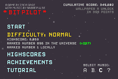
Game Review - Bit Pilot

Bit Pilot - $0.99 (Appshopper Link)

Video games have been around for a bit over 30 years now, but in that relatively short time, they've evolved considerably. Just about every aspect of gaming has changed - the graphics, the storytelling, the exposure, and the types that are out there. We've got billion dollar companies churning out games with budgets bigger than Hollywood movies and teams of more than 100 people. Yet despite this shift (or maybe because of it) a new subgenre has emerged in the gaming world - "retro games".

Originally it just included remakes or rereleases of old classics, mainly for nostalgic reasons. You're familiar with these classics: Namco's Pac-Man and Ms. Pac-Man series, Pong, Space Invaders. For whatever reason, people of a certain age like going back to these games in spite of the availability of games that are, at least on the surface, far superior.

Then came the arrival of a new type of retro game. This new type of retro game can be any genre, such as puzzle, action, shooter, etc. but usually includes some or all of the following traits: low-resolution pixelated graphics, 8-bit electronic "chip-tune" music, simple, vibrant color schemes, and lack of a meaningful storyline.

Bit Pilot is one of those new types of retro games. It's not a remake of a classic from the 70s or 80s, but it looks as if it could have been. The premise is simple. You're in an asteroid field and you're supposed to navigate your little ship to avoid the rocks and collect medicine-looking things for points. That's it. That's the whole game. Pixelated graphics? Check. Awesome chiptunes? Check. Storyline? Nope.

You control your little dot of a ship by swiping in the appropriate direction with your thumb. To accelerate faster, you use both you left and right thumbs. This is necessary when you get to the higher levels and the rocks move much faster. Some of the medicine things add a layer of shields to your ship, allowing you to take more damage. Occasionally a big laser beam comes and covers the whole horizontal length of the screen, so your reflexes are important.

As mentioned in my Tilt to Live review, these kinds of simple games that you can pick up for a few minutes to go for a high score are tremendously ideal for the iPhone platform. And in spite of this simplicity, there remains a motivation to keep playing. The game records your total score across all plays, and at certain point totals another song is unlocked, allowing you to listen to said song while playing. When you unlock all 3 songs, your next goal is to unlock iPhone wallpapers. Your single-game scores in both Easy and Normal modes are also posted to the online, OpenFeint-enabled leaderboards so you can see how you're doing against others in the world (though the game claims that you're being compared to the rest of the galaxy).

For $1, I'd recommend it for sure, especially if you like chiptunes.

Old-school title screen ftw?

I died shortly after taking this screenshot.

Wallpaper A unlocked!

Game Review - Tilt to Live

Tilt to Live - $2.99 (Appshopper link)

Many have attempted to bring big budget, full-featured games from consoles and computers to the portable, small-screened iPhone. Some games turn out well, but many of them suffer from the small screen and the lack of physical buttons. This is why certain types of games really excel on the iPhone and others don't.

Tilt to Live is an example of a simple game that really takes advantage of what the iPhone can do, while not trying to do something that the iPhone can't do. But don't let the term "simple" fool you.

With that out of the way, here's what the game is about. You control what is basically a white arrow on a rectangular playing field the size of your iDevice's screen. In gamer lingo, it's a 2-D overhead view game. Red dots appear on the screen and constantly try to kill you by touching you. Your goal is to use the iPhone's tilt controls to move the white arrow and avoid the red dots - hence the name 'Tilt to Live'.

But it's not just a survival and avoidance game. Along with the red dot enemies, weapons appear randomly which you can use to destroy the dots. There are eight weapons in all, and three of them - nuke, hadouken (my name, not theirs), and homing missiles - are available from the beginning. As you play the game and achieve certain feats, you gain Agon points. At certain Agon point levels you unlock new weapons. Achieving these feats is half the fun, and obtaining and using the new weapons is the other half of the fun. Eventually you get a freeze blast, detonating shield, spiked shield, lightning shield, and finally the "burnicade" which creates a temporary fiery wall that kills any red dots that come in contact.

Tilt to Live is a great twist on the "survive as long as you can and try for the high score" type of game. Even though you may die quickly at first, there is always an incentive to try again, whether it's to get a better score or to unlock the newest achievement/weapon.

But wait, there's more! What I described above is just one of 4 play modes in Tilt to Live, the Normal mode. Also included is Code Red, the "Normal game, but on crack," where red dots show up much faster and are many times more relentless. There's Gauntlet, in which you get no weapons and red dots are arranged in a side-scrolling "obstacle course" of sorts and you must avoid them and collect Time orbs to increase the time left on the figurative hourglass. And finally there's the newest mode, Frostbite, in which red dots start out frozen and continuously fall downward from the top of the screen. You must touch them to pop them before they reach the bottom, at which point they thaw out and come after you.

If you're looking for a game that can be either a quick time killer or something to keep you occupied on a long flight, give Tilt to Live a try.

The loading screen is always entertaining.

350 Agon points is more than enough to get all the weapons.

Choose your destiny

Red Alert!

We need a burnicade in here, stat!